
Hello and welcome to Future of Marketing.
Every other week, we send you the most relevant trends, resources, and
strategies in social and user-generated content (UGC) from leading marketers
and brands around the globe.
Did you know: the average time people spend reading a newsletter after opening it is only 51 seconds? Hope you’ll stick around a bit longer. 🙂
Today, we’re discussing attention-grabbing ads – featuring our #BrandCrush: Chanel. 💘
How Chanel captures attention
We analyzed two ads using TINT’s Attention Score heatmap technology to identify which would perform better with viewers:
Ad #1 features staged product images (with more text)
vs.
Ad #2 features hand-drawn images created
by employees’ kids (with less text)
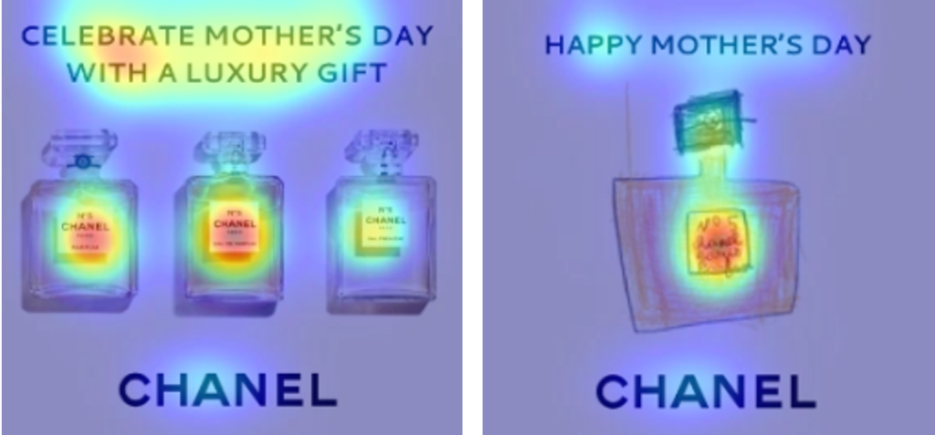
Results:
At first glance, it may seem like ad #1 (on the left) takes the medal because there are more red spots, BUT this image actually contains too many visuals – which scatters the audience’s attention.
The clear winner is ad #2 (on the right) – as indicated by the cognitive demand and clarity score of 43% and 83%, respectively. Whereas, ad #1 revealed a 62% on cognitive demand and a 48% clarity score. Interesting.
Three tips to optimize your content for more conversions:
- Add visual interest (i.e. UGC > staged photography)
- Reduce the time it takes to process information by removing unnecessary clutter
- Study eye movement and attention-tracking patterns 👀
What we’re learning
According to an email subject line study by Mailchimp:
“Short and descriptive [email] subject lines consisting
of visual pizzazz with a little humor convert better.“
In social news…
- Instagram Strongholds Influencer Marketing Despite Growing Competition
- YouTube’s New Tool Lets Creators Turn Videos into Shorts
- Pinterest Launches New Board Sticker to Help Drive More Pin Traffic
- TikTok partners with Ticketmaster for in-app ticketing purchasing options
- BeReal and the Doomed Quest for Online Authenticity
Shameless plug 🔌
Want to learn how your visual content is perceived? Give TINT Attention Score a spin.
Was that 51 seconds?
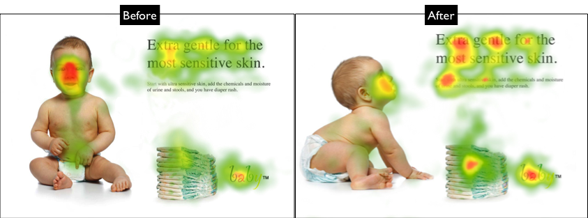
PS. Couldn’t leave you with just one study, so here’s one of babies.
Who doesn’t like babies?
🙂
Directional cues in ads
Two identical ads – with one slight difference. Notice how the baby gazes towards the copy in ad #2 and shifts the viewer’s attention towards the copy. Directional cues are just as powerful as removing clutter. 😉
Hope you enjoyed today’s Future of Marketing brief. Hit reply if there’s something you’d like to see from us in the future.
Until next time! 👋🏼